Christian Science Mother Church, Extension
175 Huntington Street
Boston, Mass.
Year Built: 1904
Construction for the Extension began in 1904, and the cornerstone of the new auditorium was laid on July 15th. The Extension was built primarily of Indiana limestone, but sections of the first and second floor walls are constructed with granite from Fitzwilliam, New Hampshire and Tennessee marble is occasionally used at the entry.
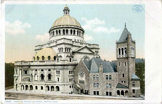
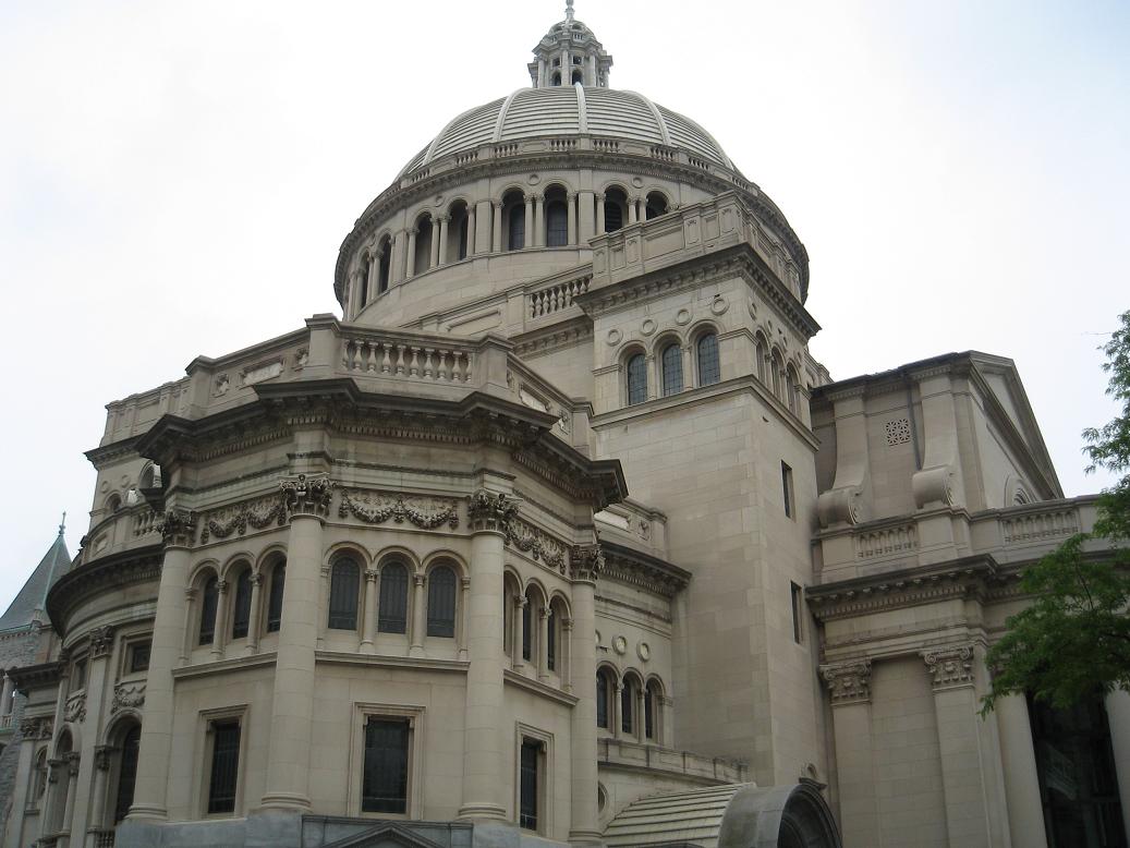
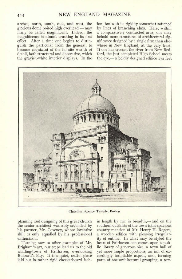
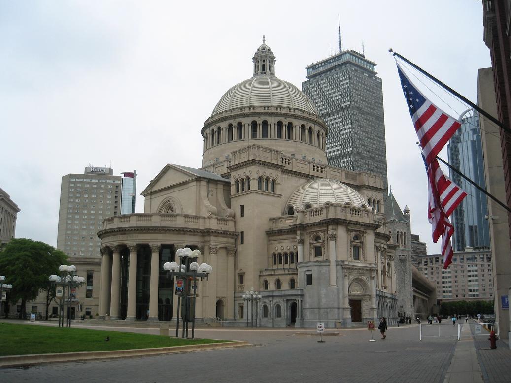
The Mother Church Extension is a cathedral-scale, Byzantine and Renaissance Revival-style church, contiguous at its east end with the much smaller Original Mother Church (1894). The Extension constituted the second and largest phase of the church’s development. When viewed from the east, with the Original Mother Church in the foreground, the Extension forms a dramatic backdrop to the older and smaller building.
As with the Original Mother Church, the constraints imposed by existing street patterns, programmatic requirements, and zoning restrictions primarily dictated the form of the Extension building, which covered nearly the full extent of its original lot. Its overall outer footprint is roughly trapezoidal in shape and corresponds to the irregular historic site configuration formed by St. Paul (west), Falmouth (south), and Norway (north) streets. The building measures approximately 256 feet wide at its greatest extent along the west elevation, and 156 feet deep, west to east.
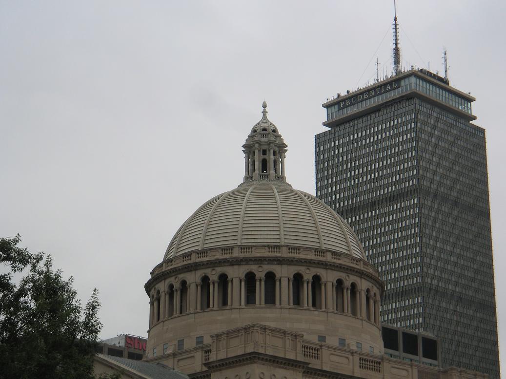
The Mother Church Extension rises five stories at the center to a two-story ribbed dome that measures 82 feet in diameter and extends 224 feet above grade. The majority of the superstructure, including the main dome, has a steel frame skeleton; the perimeter exterior walls are self-supporting masonry. The main dome rests on a circular steel ring that transfers the roof load to four steel trusses encased in massive stone pendentive piers at the corners of the central block. The half-dome roofs on the north and south wings are constructed of layers of thin ceramic tile laid in the Guastavino vault form technique.
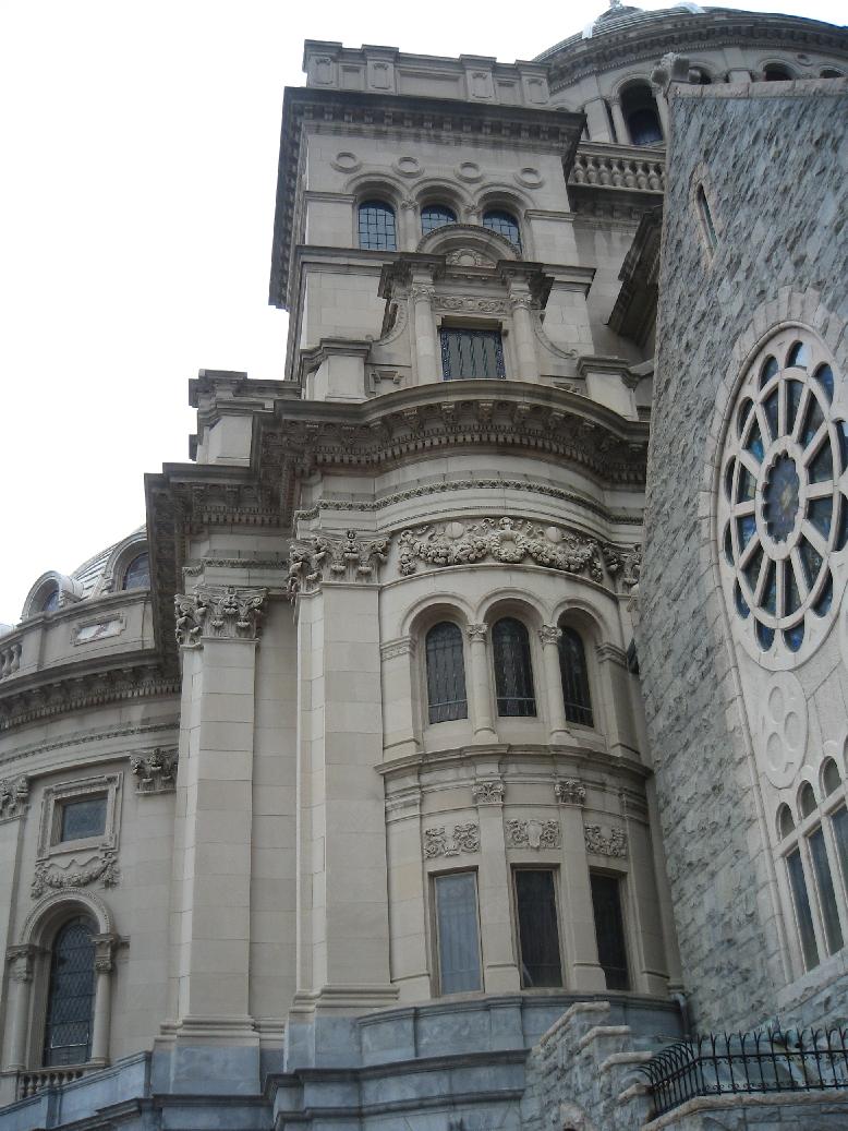
The Mother Church Extension is built primarily of light-colored Indiana limestone. The first-floor level is faced with finely dressed New Hampshire granite of a uniform gray tone and fine grain that references in color the similar rock-faced stone of the Original Mother Church. Even surface textures and flush masonry joints create smooth wall surfaces enlivened by extensive decorative carved detailing, executed mainly in limestone and granite, with some white marble accents. The roofs of the main and half-domes are covered in light gray terra cotta tile.
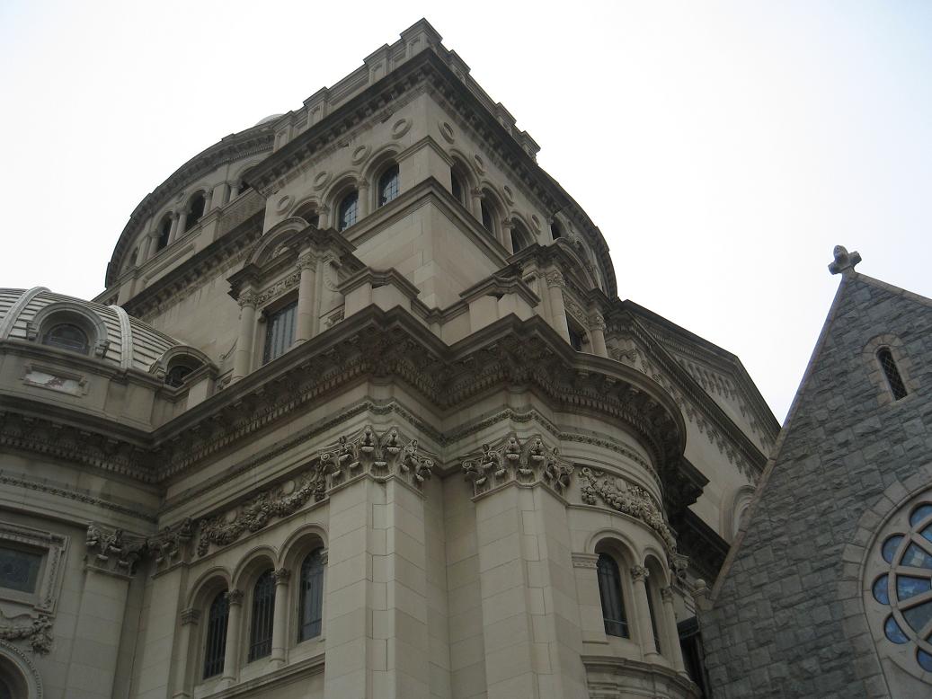
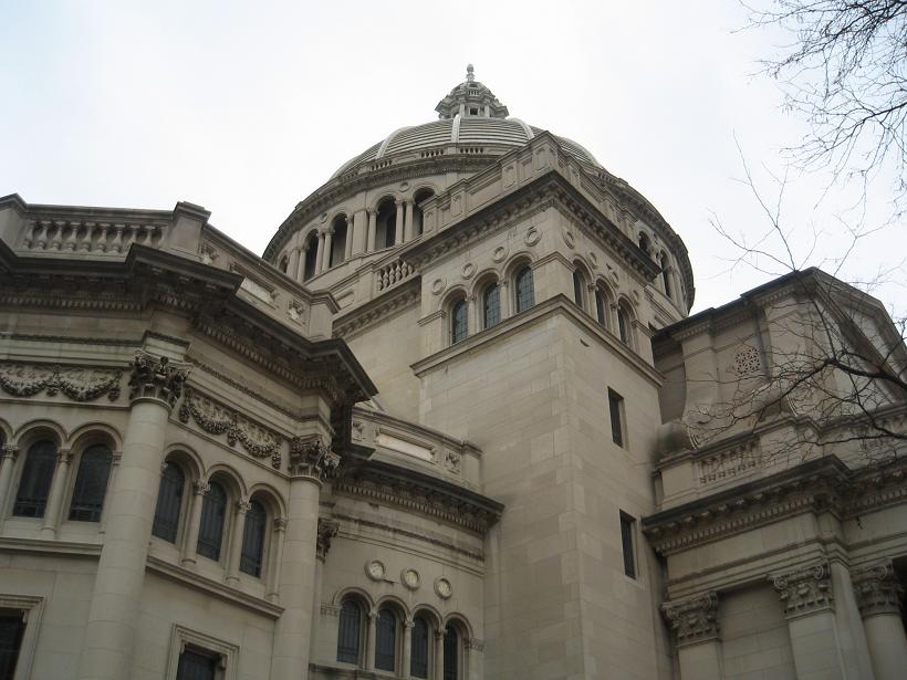
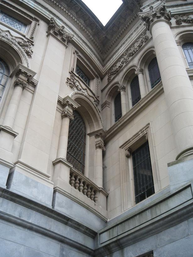
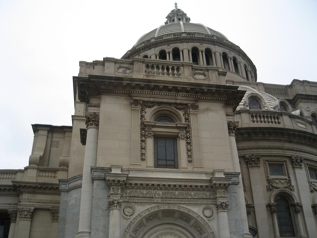
Aside from the Eastern Byzantine aesthetic that inspired the domical roof and square plan of the building, the majority of the Extension’s stylistic treatment is derived from the Classical Revival architecture of the Italian Renaissance. The multiple projecting components of the building all have a hierarchical, three-part arrangement of an architectural base, a single order of pilasters, and a complete entablature. The Ionic order predominates on the first floor and the Corinthian is featured on the upper levels. Roofs are invariably outlined by a perimeter balustrade or parapet. Overall, the ornament is diverse in form and not completely symmetrical. Sculptural decoration consists of columns, pilasters and lintels, as well as dentils, modillions, and all manner of decorative moldings. Robust carved, often fruited, and swag classical ornament enriches the window and door frames and the entry and tower architraves. Circular elements punctuate intervening wall surfaces.
Arched windows and open arcades are generally trimmed with engaged Ionic or composite columns or colonettes. Tennessee marble is used for delicately carved recessed bands, architraves, arcade capitals, and tympani over doorways. Strong horizontal lines drawn by the string courses, cornices, and parapets that encompass the building unite the myriad sculptural shapes and serve as a grounding counterpoint to the emphatically vertical central core.
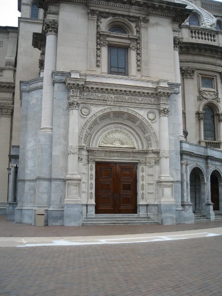
The building’s multiple entrances are asymmetrically placed on the north, west, and south elevations. Two original primary entrances, one each on the west and south elevations, are prominently featured in elaborately detailed openings, while others are handled more simply. Many are recessed within single or multi-arched loggias. Constructed of paneled and carved oak, the exterior doors are used in both single and double-leaf configurations.
The main sections of the Extension are lit by a combination of arched and rectangular windows. Unlike the figured stained glass of the Original Mother Church, most of the window openings in the Extension contain translucent glass panes with a textured surface decorated with minimal bands of free ornament and other architectural forms painted in colors. Some of the windows have structural and ornamental dividing members, particularly the large auditorium windows; occasionally opalescent glass was used. Byzantine-influenced designs appear in the glass in the dome and half-dome windows, and the rose windows in the east and west gables have a larger percentage of decorated glass.
The complex massing of the Extension is organized around a square, flat-roofed central auditorium block at its core, which remains mostly concealed by a variety of classically ornamented, applied volumes. Rectilinear tower shafts define each corner and culminate in an open, triple-arcaded element echoing the Original Mother Church tower. The flat-roofed towers are capped by a modillion cornice and paneled parapet that continues around the central block in alternating paneled and balustered sections.
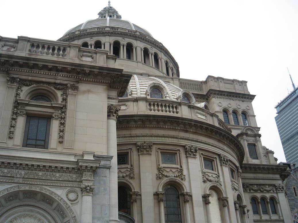
The cylindrical base of the central dome is pierced with rectangular windows that are not visible from the street. Above this base is a band of 16 bays of paired arched openings with clustered center colonettes that form arcading around the dome’s upper story. Round-arched windows are deeply recessed behind this arcade, and a cornice and balustrade similar to the main block and towers encircles the dome above the arcade. The ornately detailed belfry cupola atop the dome stands approximately 36 feet in height; it is articulated with arcading, a balustrade, a terra cotta onion-dome roof, and a pineapple finial. The Mother Church Extension has three fully visible side elevations facing generally west, north, and south. The north and south elevations angle towards each other from west to east along the historic street lines, and are similar in massing and treatment, while the west elevation is unique. Only small portions of the east elevation are visible, above and flanking the Original Mother Church edifice.
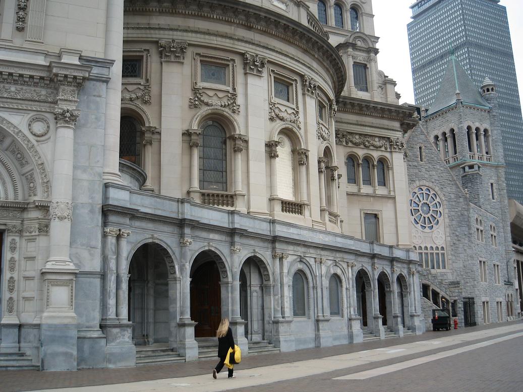
The west elevation, facing Massachusetts Avenue, is the widest and principal façade of The Mother Church Extension. Only when viewed from this direction does the building appear to be a completely free-standing structure. The asymmetrical but balanced composition of elements was originally centered on a shallow, three-story pedimented pavilion with a large rose window, which remain today. Other features, such as the pattern of arched and rectangular windows, pilastered bays, and third-story cornice, were modified with the addition of the Portico in 1975, described below.
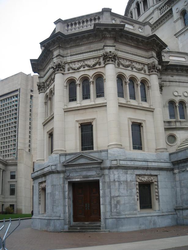
Flanking the entrance portico and central pavilion of the west elevation are secondary entrances, curved ambulatories that step progressively inward, and corner towers. To the north of the Portico, an ornately detailed, two-story barrelvaulted entrance vestibule within a frame of pilasters and columns projects at the ground level. A curved second story wall runs above, surmounted by an arcaded third story ambulatory. These elements intersect a three-story octagonal tower at the northwestern corner of the building, which features a small pedimented entrance in the northwest bay, engaged Corinthian columns at each facet joint, ornate foliated swags above the arcaded third floor windows, a stepped cornice, and a rooftop balustrade. Rectangular first and second floor windows, an arcaded third floor, Corinthian pilasters, and a dentil and modillion cornice visually unify this portion of the building.
To the south of the Portico, the west elevation consists of a ground-level, colonnaded arcade with a recessed entrance, a curved second floor ambulatory with round arch windows, and a third floor arcaded ambulatory. These elements connect to a three-story square tower that marks the southwest corner of the building, rising to a prominent cornice and rooftop balustrade.
Ground level apsidal projections on the east and west sides of the tower vary in height and roof shape (flat and domed) and provide space for interior staircases. Near each of its corners, the tower’s east and west walls display three-quarter columns resting on the first-floor plinth. A primary building entrance is set in the south façade of this tower, consisting of a highly decorative and monumental round-arched surround, framed by double-height columns under a second-story belt course. The entranceway is surmounted by an arched window with two sets of pilasters and a cascading foliated swag on the upper floor.
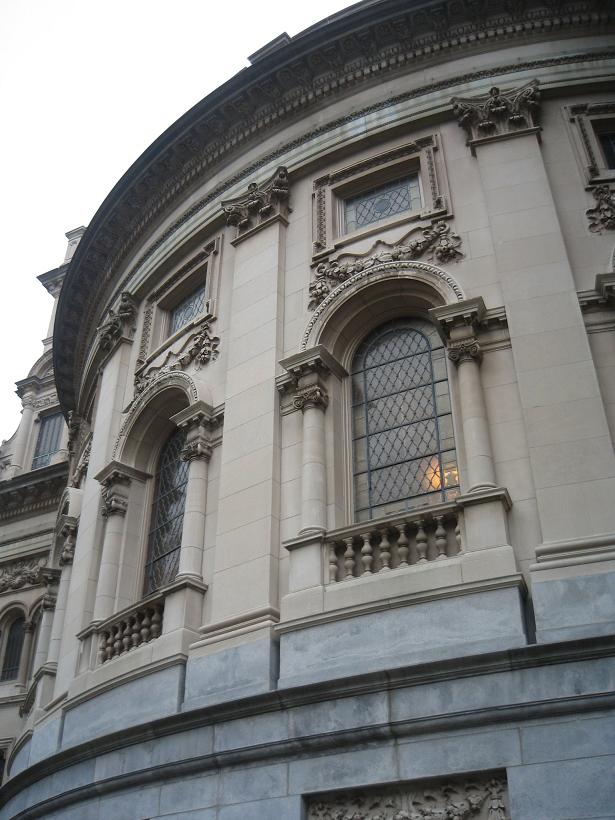
The north and south elevations of the Extension exhibit similar but not identical treatments, comprised of a three-story corner tower on the west (described above); a dominant, semicircular wing in the center; and a rectangular east corner. The symmetrical, three-story semicircular wing reaches between the corner tower elements of the main block on the north and south façades, rising to a two-story high dome that is pierced by round-hooded dormers with circular windows. These hemicycles are articulated on the second and third floors by flat, two-story pilasters with Corinthian capitals, delineating bays of single round-arch windows that are framed by slender columns and topped by a swag and a square window. A generous entablature on these wings culminates in a projecting dentil and modillion cornice and a paneled and balustraded parapet repeated from the central block.
The south-facing Plaza façade of the Extension displays visual prominence in both the current and historical site configurations. The southwest corner tower is described above. A one-story arcaded loggia extends the remaining length of this façade at ground level, beneath the second and third story hemicycle wing. The vaulted loggia ceilings are constructed of overlapping, unglazed light blue tiles laid in a zigzag Guastavino pattern. Bronze light fixtures hang from the center of the vaults. A second floor window in the hemicycle extension contains a marble dedication tablet for The Mother Church Extension, ornamented with decorative bas relief. At the southeast corner of the building, above the loggia, the building is articulated by a corner pilaster, rectangular and arcaded windows, decorative swags, and a continuation of the central block’s cornice and parapet. A tall, round arch dormer with a rectangular window, engaged columns, and cornice heightens the appearance of this corner element.
The north elevation of The Mother Church Extension, facing the former Norway Street corridor and the Publishing House building, is similar to the south elevation, with two major differences. Instead of a first floor loggia, this elevation’s ground level features a simple rhythm of punched window openings with ornate, cascading swag decoration. The tower at the western corner of this elevation is octagonal instead of square, and is described with the west façade, above.
On the east (rear) side of the building, most of the Extension is integrated with the west wall of the Original Mother Church. One-bay wide sections of the center block’s corner towers are exposed, however, at the north and south ends of this wall, beyond the volume of the Original Mother Church. These bays have shallow curved walls with rectangular and round-arch windows, elaborate foliated swag decoration, and a tall round-arch dormer above the parapet. A large pediment, similar to the one on the west elevation, rises above the Original Mother Church roofline. Drip molding detail in the rakes of this pediment departs from the overarching classical styling of the Extension, and defers to the Romanesque style of the adjoining Original Mother Church.
A monumental, Neoclassical-style entrance portico, semicircular in shape, was attached to the pedimented pavilion on the west elevation of The Mother Church Extension in 1975.
The Board of Directors first hired E. Noyes Whitcomb of Boston, the builder of the English Gothic Revival-style First Church in Mrs. Eddy’s hometown of Concord, New Hampshire (1904), to work on the extension plans. Whitcomb recommended the Boston architect Charles Brigham because of the distinctive Unitarian church he had designed in Fairhaven, Massachusetts (1901-1902), as well as his experience with public buildings such as the Museum of Fine Arts in Copley Square (1876-1878, demolished 1906). Brigham and his chief assistant Charles C. Coveney were the initial principal designers for The Mother Church Extension.
Whitcomb died suddenly in 1905, and the Board invited Solon Beman, the architect of numerous Christian Science churches in Chicago, to replace him. When Brigham became sick and went to Bermuda to recover, Beman came to Boston to act as the principal architect for the project and significantly influenced the final designs for the new church. The engineers for The Mother Church Extension project were J. R. Worcester & Co. of Boston.
Upon its completion, the massive Mother Church Extension “manifested its existence with such abundant architectural vehemence” that it provoked substantial critical response.13 Many people viewed the ambitious size and style of the building as a statement of the Church’s presence in the city, which was interpreted in both negative and positive lights. The 20th annual exhibition of the Chicago Architectural Club, held in 1907, called The Mother Church Extension “important” but also deemed it “an enormous, domed monstrosity.” A Boston Globe article on the dedication of the Extension described the view of the church from Huntington Avenue as “in many respects the least satisfactory. There the façade seems to be an irregular succession of angles and curves, and of almost confused use of stone and design.”14 Other critics saw the Extension as a universal form of public architecture, inspired by City Beautiful ideals and suitable for churches, clubhouses, and city halls. Frederick Coburn suggested that it represented a “new modern church architecture.”
However mixed the reviews of its appearance, The Mother Church Extension solidified the decidedly Classical Revival architectural manifestation of Christian Science. By 1930, over 2000 branch churches of The Mother Church had been built around the country. Like the Extension, the churches are typically square plan buildings with pedimented porches, often crowned by a low dome centered over the auditorium. Ionic columns, frequently of marble or terra cotta, and classically inspired details such as arcading and pilasters were favored in many church designs.
Within Boston, The Mother Church remains the largest and most architecturally significant Christian Science church edifice. The Second Church of Christ, Scientist, Boston, located in Roxbury, is a much smaller domed granite building with a cruciform plan and minimal ornament, designed by Shepley, Rutan, and Coolidge in 1914. The Third Church of Christ, Scientist, Boston, occupies a gabled wood-frame structure with a two-story bell tower in Hyde Park.
The Mother Church Extension represents the apex of the debate among Christian Science Church members over the appropriate architectural presence of the Church. It is a distinguished example of a Classical Revival basilica with a Byzantine plan and reflects the joint influence of Boston architect Charles Brigham and Chicago architect Solon Spencer Beman on the final design of the building. The Extension also illustrates the prevalence of the Classical Revival style in Christian Science architecture and, more generally, in public buildings of the early 20th century.
When Brigham designed this building, the driving forces behind the building’s shape was the need for the church to be able to hold 3,000 people against the small size and odd shape of the lot. Brigham devised the extension to take on proportions of a mosque but in the Renaissance Revival style with interesting Classical Revival elements.
Brigham designed a number of ancillary structures to the extension, including a boiler house and a tunnel running underneath St. Paul Street.
Registries
• Local Landmark
References
• Reports of Proceedings of the City Council of Boston for the Year 1905, pp. 328 and 344.
• Massachusetts Cultural Resources Information System, Massachusetts Historical Commission, Inventory No. BOS.7520 (First Church of Christ Scientist Mother Church, Charles Brigham, noted).
• "A Terra Cotta Cornerstone for Copley Square: Museum of Fine Arts, Boston, 1870-1876, by Sturgis & Brigham." Margaret Henderson Floyd, Journal of the Society of Architectural Historians, May, 1973, fn. 30.
• "A New England Architect and His Work," Oscar Fay Adams, New England Magazine, June, 1907 (Brigham and Coveney, architects). http://www.millicentlibrary.org/brigham.htm
• "The Story of a ‘Town House,’" Mabel Hoyle Knipe, Fairhaven, Mass, 1977 (Christian Science Mother Church, extension, Charles Brigham, architect). http://www.millicentlibrary.org/townhall.htm
• http://www.tfccs.org/
• "Charles Brigham," MacMillan Encyclopedia of Architects, Adolph Placzek, entry written by Margaret Henderson Floyd, 1982, p. 288-9 (Christian Science Mother Church (extension), 1904-1909, Charles Brigham architect).
• "The Designing and Building of The Mother Church Extension, Boston, Massachusetts," Charles Coveney (author), 1934, on file at the Mary Baker Eddy Library, Boston.
Images
2009
2009
2009
2009
2009
2009
2009, exterior detail
2009, exterior detail
2009, exterior detail
2009, exterior detail
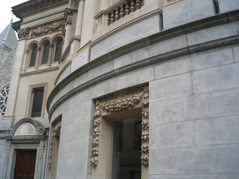
2009, exterior detail
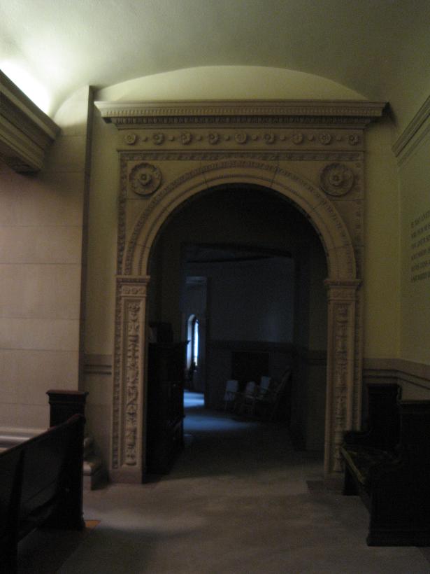
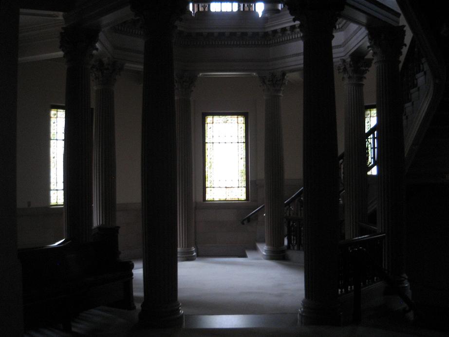
2009, sanctuary
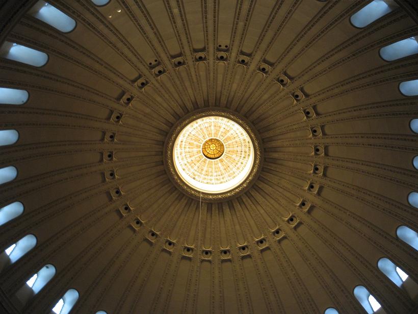
2009, sanctuary
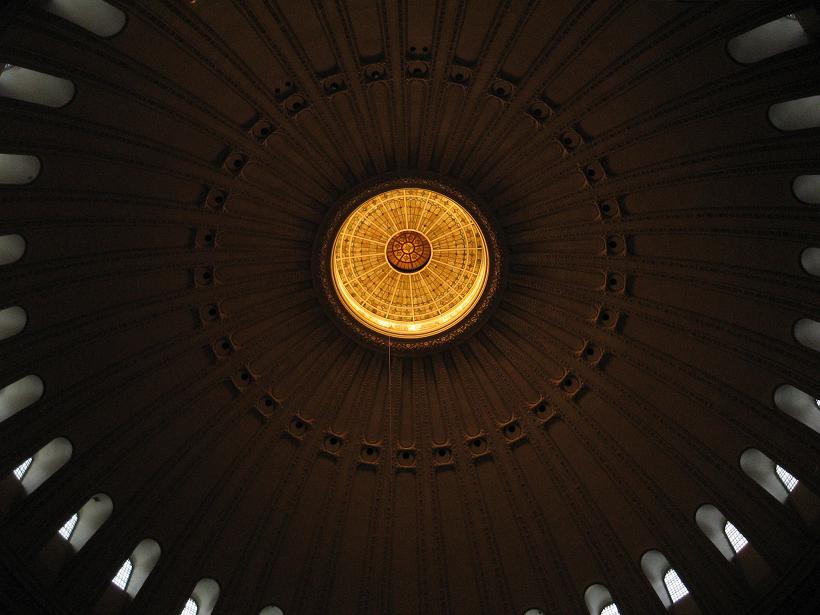
2009, sanctuary
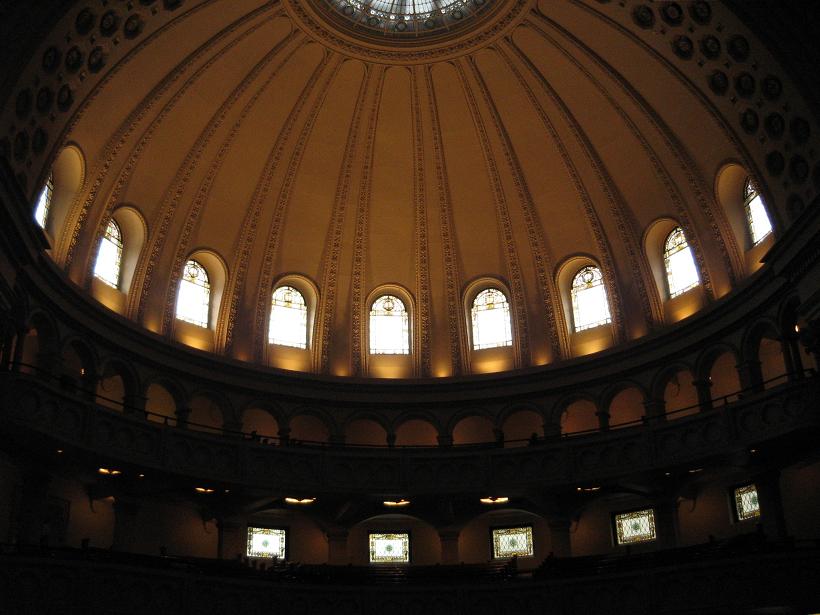
2009, sanctuary
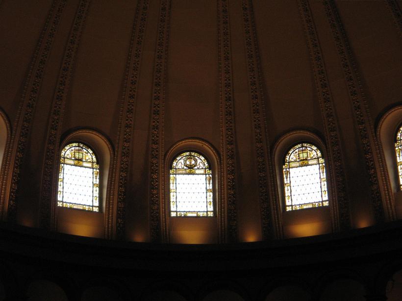
2009, sanctuary
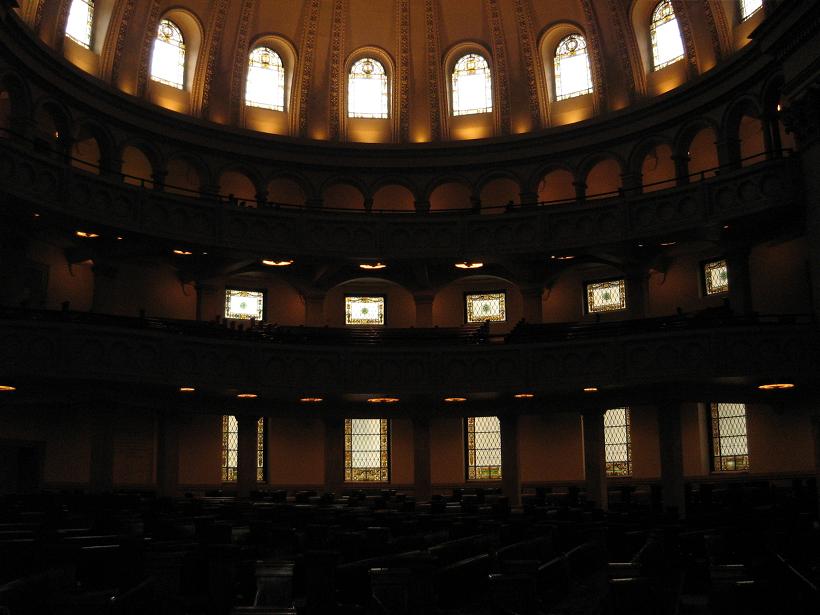
2009, sanctuary
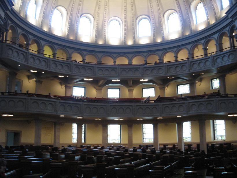
2009, sanctuary

2009, sanctuary
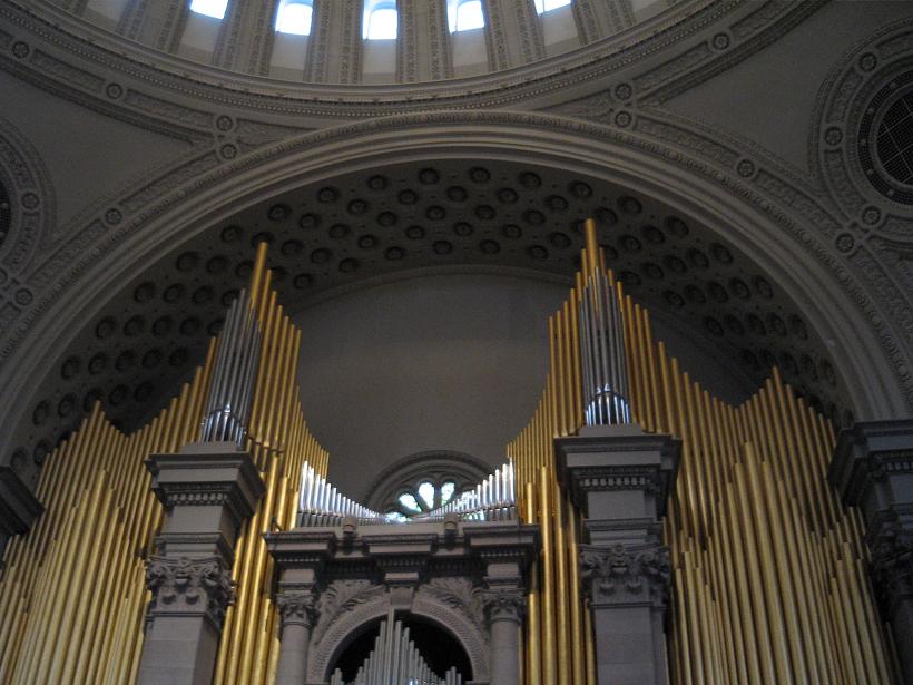
2009, sanctuary
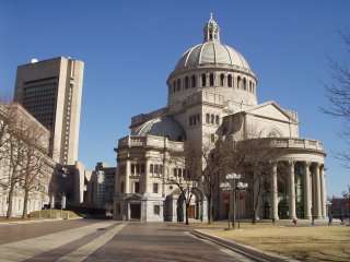
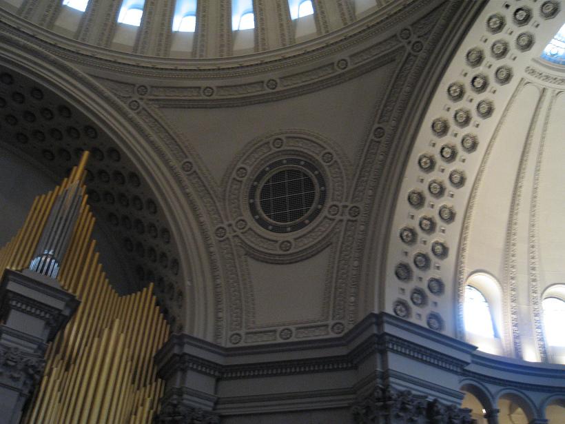
2009, sanctuary
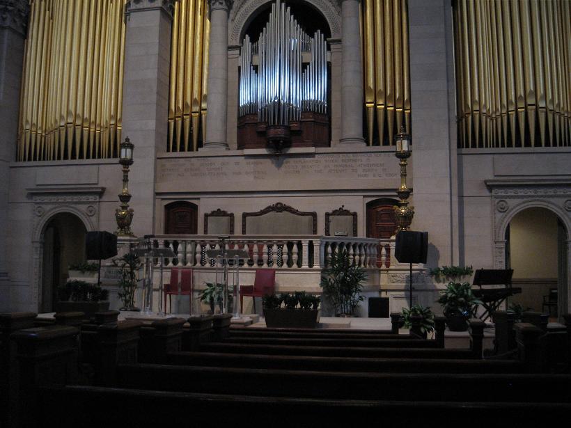
2009 sanctuary
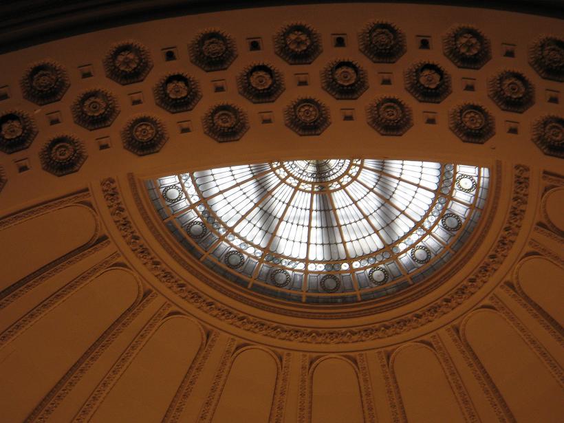
2009 sanctuary
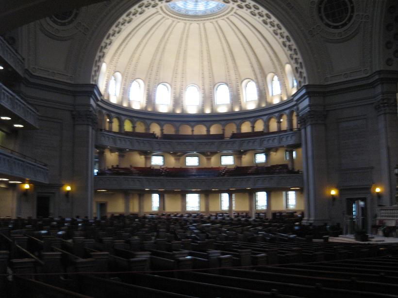
2009 sanctuary

2009 sanctuary
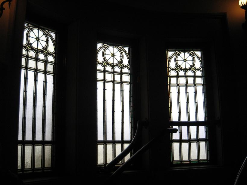
2009 stained glass
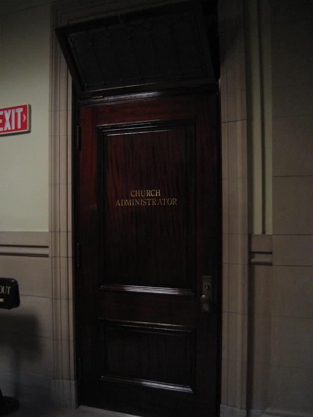
2009, door in undercroft
2009, transome in undercroft
2009, ceiling trim in undercroft
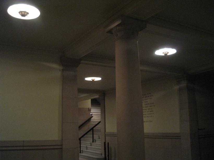
2009, undercroft
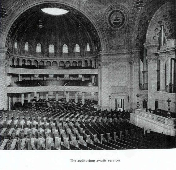
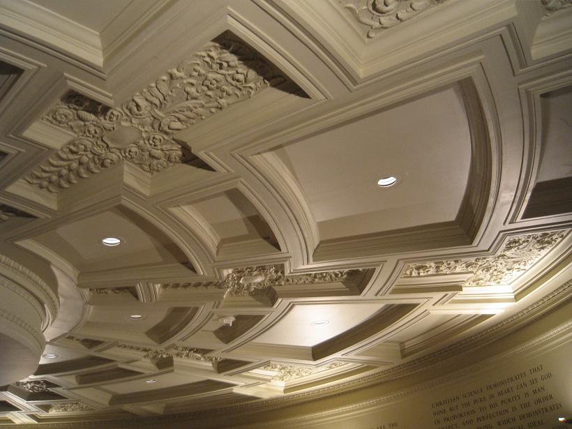
2009, celing detail in undercroft
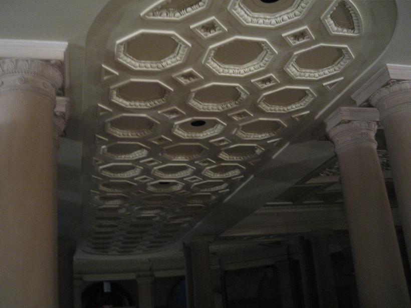
2009, celing detail in undercroft
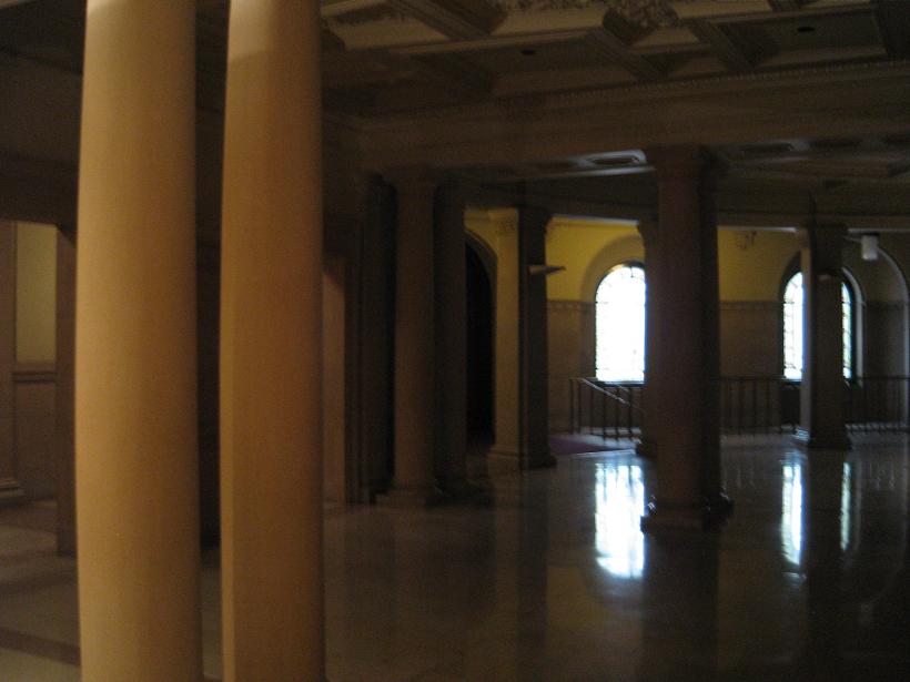
2009, undercroft
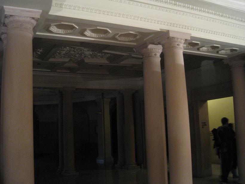
2009, undercroft
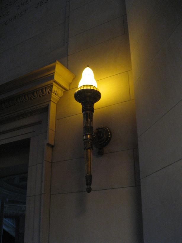
2009, light fixture in sanctuary
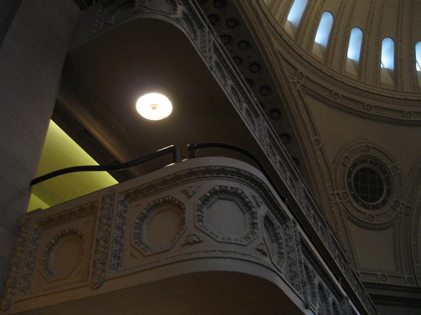
2009, sanctuary
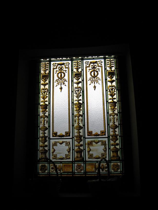
2009, stained glass
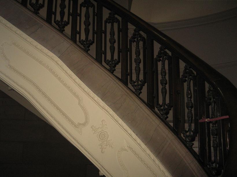
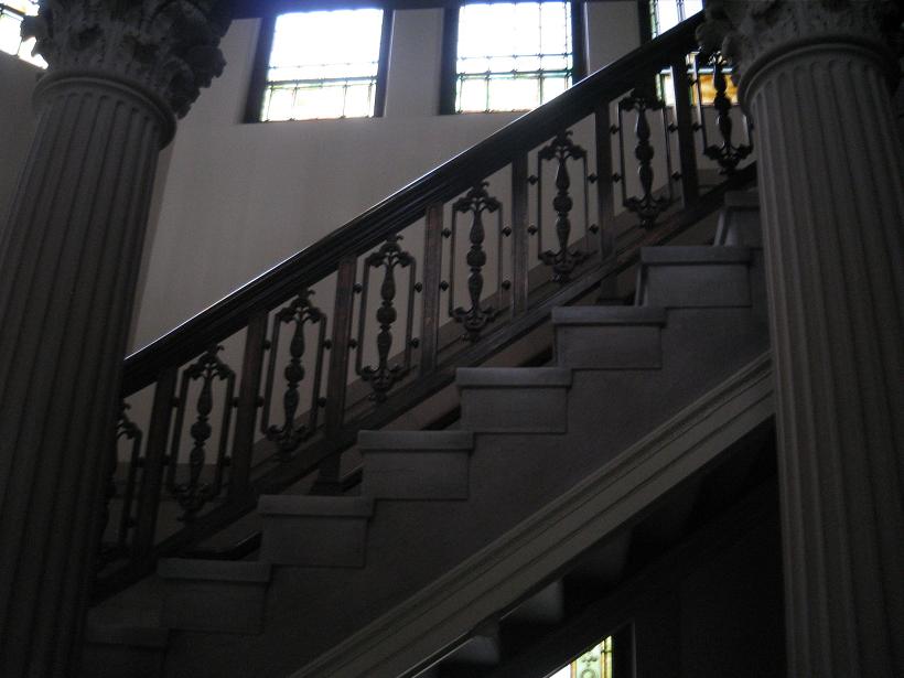
2009, staircase detail
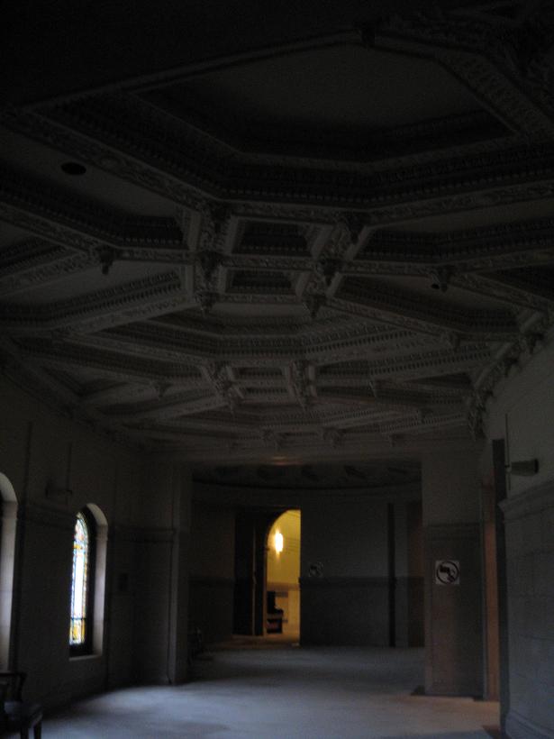
2009
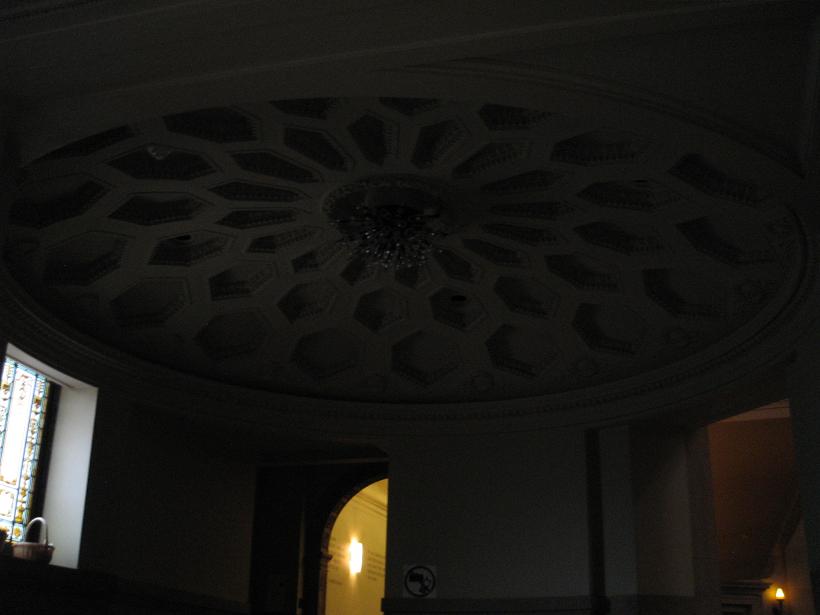
2009, ceiling detail
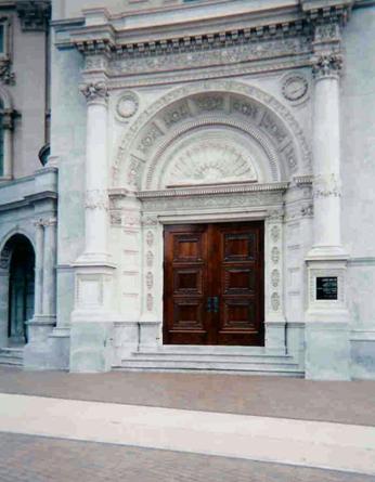
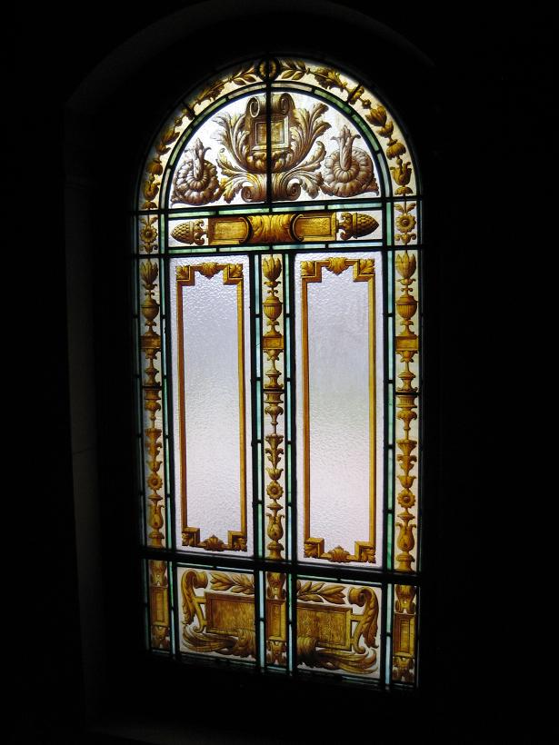
2009, stained glass
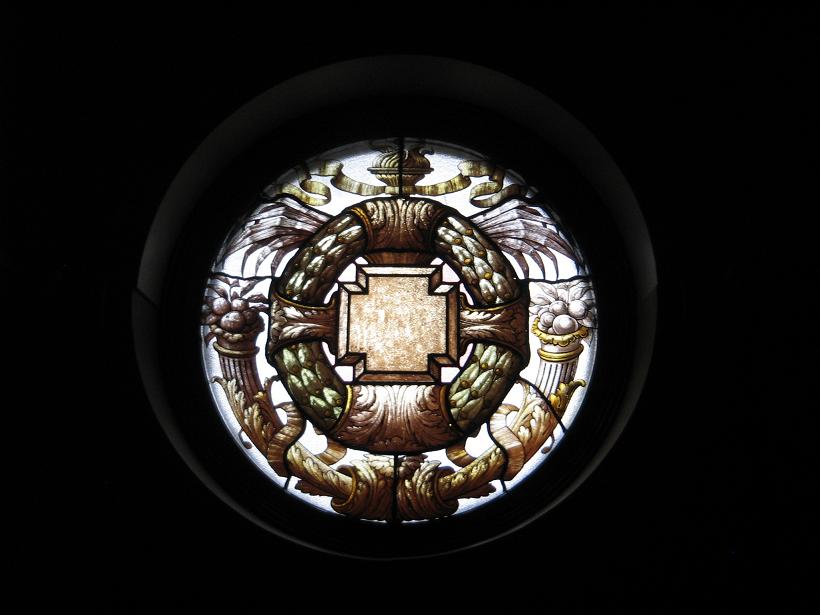
2009, Stained Glass
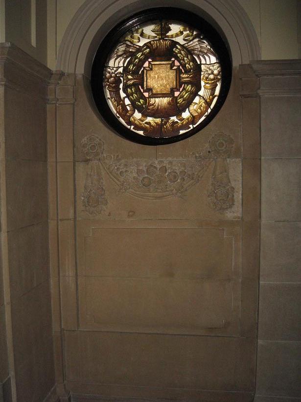
2009, stained glass
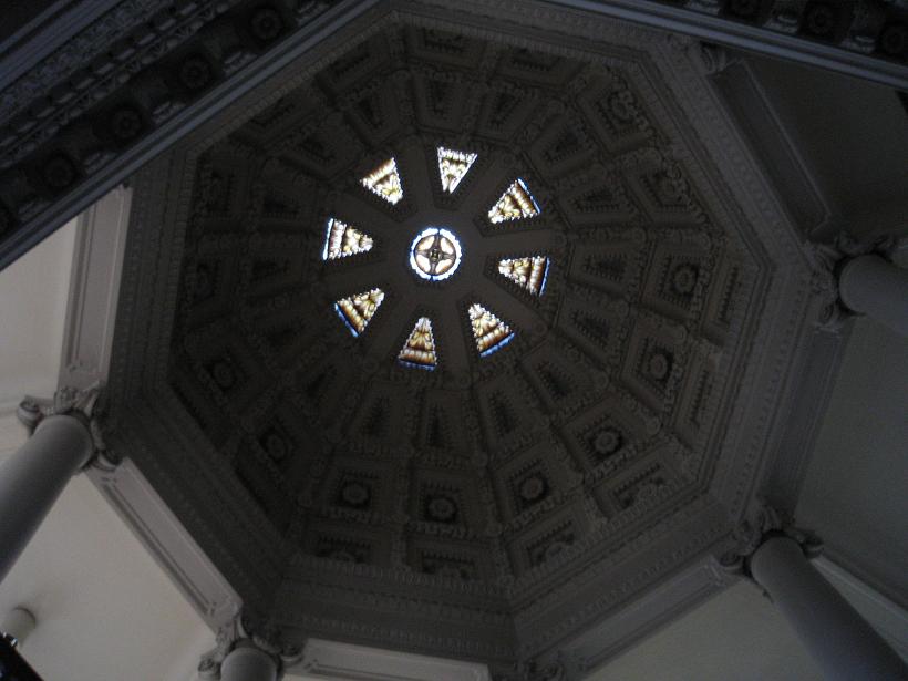
2009
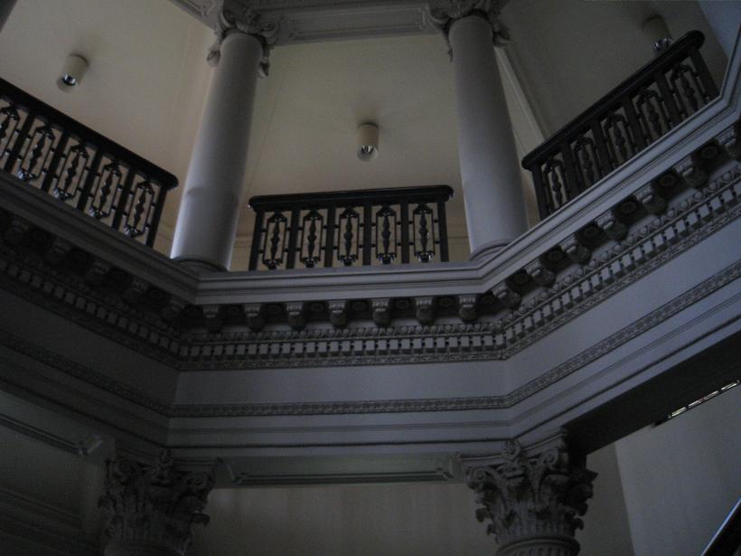
2009
2009
2009
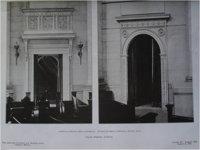
American Architect and Building News, August 11, 1906, No. 1598, Doorways
2009
2009
2009
<<< Back to Design List
|
|
|